Tuesday, 14 December 2010

Pitch

Pitch

My magazine will be named "Invasion" and will be aimed at young males, aged around 16-19 years old. I have gone for this target audience as this is the age and gender of the average reader, and therefore would be more appealing. Despite the target audience being of a young age, they are very dedicated to music and therefore my magazine will feature a large amount of text, and will not be picture heavy unlike magazines of a similar age range. My magazine will focus on the genre of indie/rock as these are the genres that seemed to be the most popular when polled, and therefore would be more engaging. The style of my magazine will be similar in layout to other magazines such as NME, but will not use the colour scheme of white, black and red. This is so that the magazine will be different to others out there, and will not blend in with magazines of a similar purpose. The magazine will cover interviews with established artists, and up and coming ones along with album and gig reviews. My double page spread will feature an interview with the lead singer of a new indie band, who have broke the music scene at a young age. It will discuss how the lead singer feels about having been signed at a young age and their plans for 2011. I have decided to do this as I feel readers would like to hear about new bands, and how they entered the music industry as alot of readers themselves would like to do this.
Thursday, 9 December 2010

Flat Plans - Double Page Spread

Flat Plans
Double Page Spread

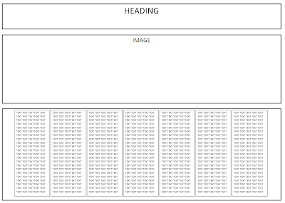
The following are my flat plans for my double page spread.

Flat Plan 1:


Flat Plan 2:


Flat Plan 3:


Flat Plan 4:

Flat Plans - Contents Page

Flat Plans
Contents Page

The following are the flat plans that I have created for my contents page:

Flat Plan 1:


Flat Plan 2:


Flat Plan 3:
Flat Plan 4:

Flat Plans - Front Page

Flat Plans
Front Page

The following images are the flat plans that I have created for my front page:

Flat Plan 1:


Flat Plan 2:
Flat Plan 3:
Flat Plan 4:

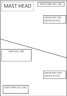
My idea for the fourth idea is not explained in detail by the flat plan. The idea is when I am editing my image, I shall have the photo in two sections, as shown above. The front cover will have just one photo one, with each section being a different editing style e.g one section as it has been taken and one section black and white.

Flat Plans

In order to experiment with the layout of my magazine before creating it, I have created a series of flat plans. These flat plans show where each element of the page is going to go and will give me a basic visual idea of what my magazine will look like. I have created four flat plans for the front page, four for the contents page and four for the double page spread in order to give myself a variety of choice.

Style Sheet