Friday, 4 March 2011

Evaluation - Question Four

"Who would be the audience for your media product?"

From my research I gathered that the ideal audience for my product would be a young male aged 16-19, however I understand that my product would also be suitable for the female demographic and for older readers however they might not find everything to their tastes as it is designed specifically for the above stated audience. I have developed a "media-pack" in order to correctly show who my average reader would be.

Tom is aged 18 and has just started university after acheiving good grades at his A-Levels. He works around his university course in order to fund his lifestyle. He is devoted to music, he has the latest iPod in order to keep his ever growing record collection under control, which includes a mix of mainstream indie/rock, some popular chart music, classic rock and a large range of up and coming bands that are not widely known. He strives off being able to inform his friends on the latest bands and albums out. In addition to his wide music collection he has been attending gigs from a young age and for the last few years has been attending several festivals. He can play a musical instrument, the guitar being his chosen instrument which he taught him self to play. His style is quite basic, although fashionable. He usually shops at topman to keep up with the latest fashion but also like shops such as hot topic and collects tshirts from gigs in order to display his musical taste to the world. He normally styles these with converse. He has a myspace page which is filled with recordings of his guitar skills along with his own songs although this is just a hobbie. Tom likes to drink alcohol at weekends and particullatly at gigs although he makes sure he does so in moderation.


Evaluation - Question Three

"What kind of media institution might distribute your media product and why?"


A media institution is a company that deals with media texts. They can be in charge of production, marketing, distrubuting or regulating, or a combination of media texts. Institutions work in a business style structure, with the employees working towards a common goal that the institution has set. There are several media instutuions in the United Kingdom such as:


The institution that I feel would distribute my media product would be Development Hell. I think this institution would because it is a small independent institution, with its portfolio only covering two other magazines which both are monthly music magazines; The Word and Mixmag. I feel this is the institution that would distribute my magazine over others due to the fact that it is a small company; my magazine is based at teenagers/young adults who are serious about music, which makes my magazine quite a niche product. I feel a smaller company would be best to distribute it over companies such as IPC Media who have a large portfolio of magazines, which have a large consumer base. I feel a company like this, who deal with music magazines such as NME which is a very popular magazine, wouldn't be able to market my magazine well, or be satisfied with having a niche product which may not produce a profit as high as NME. I think the internal compition with popular magazines - not only music magazines, but several others - would tamper with the success of my magazine.
Development Hell is a small institution based in London, which has also provided consultancy services for publishers and employs respected names within British magazines. According to http://www.abc.org.uk/ the average circulation per issue in 2010 for Development Hell's magazine The Word was 25,048 and in 2009 the average circulation per issue for Mixmag was 26,116. In comparision with figures for NME (238,850) the numbers seem quite small, which supports my decision to use Development Hell to distribute my magazine.
There are both advantages and disadvantages of using Development Hell as the institution to distribute my product, but I feel the advantages weigh out more than the disadvantages. As Development Hell deals with only music magazines this could be a benefit, as the company understands how to market a music magazine, and understands the codes and coventions needed to be followed, and how to create successful music magazines, it offers the best chance to make my product successful. In addition to this, my music magazine is of a different genre of the magazines it currently distributes so therefore it would be an advantage for Development Hell to distribute my music magazine as it would bring a new consumer base to the company and focus on a different demographic group than the ones already targeted which would stop internal competition. However, Development Hell may not want to distribute another music magazine, and want to move into different areas in order to bring a wider demographic audience into the current ones, and want to widen their portfolio.
I feel that although my magazine is of a similar purpose to the magazines already distributed by Development Hell, this would be the institution that might distribute it due to the different audience it focuses on combined with the fact it would not be a widely consumed magazine, much like the ones currently in distribution and the fact that Development Hell is institution that specialises in music magazines. 


Evaluation - Question Two

"How does your media product represent particular social groups?"


There are many social groups within society such as ethnicity and class, with my product addressing certain social groups and representing them in several ways.
I have not represented any ethnicity other than white-British, which shows that my genre of magazine is dominated by this ethnicity. However, I have only used images of two bands; this therefore could represent that other bands are of another ethinicity but it is not clearly stated. The white-British ethinicity is shown to be powerful as they model on the front is from this ethnic group, along with being successful, as I have shown all the bands to be very successful.


There is a large difference in the gender gap between men and women; all the images I use are of males. This represents the fact that the genre I am writing about is male dominated. I have mentioned women on my front cover and contents page; however, as there are no images of these women, I have shown how they are not as powerful as the men, it could also be interpreted that they are almost "invisible" within the genre. I have used positive language when I am referring to the male bands/artists e.g."sensation" and "legendary", this represents the fact that males are successful and happy in their life. In contrast, when referring to the women I use less positive words, such as "hell" and "wild child", this shows the women to be rebellious, and seem less like role models as the males seem.

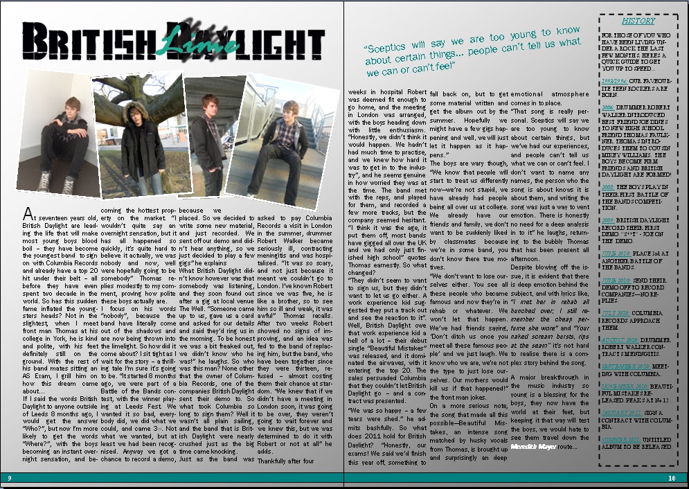
I have shown there to be a variety of age within the artists featured in my magazine, however the main age group I focus on is the teenage age range. My double page spread is on a group of teenagers who have just become famous within the music scene; I have shown them in a positive light. I have shown them to be dedicated to studies, "We said we'd finish this year off, something to fall back on...." along with have a  "feet on the ground" attitude, "We know who we are, we're not going to just lose ourselves..." This shows how mature they are for there age. The following are some of the photos that accompony the article:


These show the different attitudes of teenages; we are shown a typical "moody" shot of the model, he represents the stereotype of teenagers, and shows how society deems all teenagers to be, this image represents the whole teenage population, however by having the text accompying it, we are shown how teenagers are not only moody, they can be positive and not always the "bad" people they are usually represented as.
The other image shows the model looking coy, this could show how teenagers are awkward and embarrased at a young age, and are dealing with identity and other issues, looking away from the camera shows how they are not also full frontal.

I have spoken about young adults within my magazine, but not in great detail, with statements showing how they are much more rebellious, and "off the rails". This is showing this age range to be quite irresponsible, and not as mature as stereotypically they could be seen. I have also used words such as "legendary" when talking about a band who have had a decade apart (this shows they are of an older age), which shows that being of a slightly older age is not a negative thing.

As the above images show, along with the image on the contents page show that class is not dealt with in my magazine, as the clothes are quite casual, and the surroundings are neutral, showing no particular economic group divisions within the magazine.


Evaluation - Question One

"In what ways does your media product use, develop or challenge forms and conventions of real media products?"

My media product, a music magazine, uses and develops forms and conventions of real music magazines in several ways. During my research I analysed in detail exsisting music magazines, and used the knowledge gained when creating my own music magazine, however I put my own interpretation upon them, and decided against following some of the aspects of a music magazine. I feel that I have not challenged many of the forms of a real music magazine, as I feel they work, so I have therefore just used and developed most of them.


Front Cover


Use: 
For my front cover, in order to attract the reader and gain intrest in it, I added a list of names that will be in my music magazine, much like the front cover of Kerrang!:


To give coherence with other music magazine, and to make sure that there is some familiarity for the readers, I have kept the concept of having my masthead at the top of the page, along with having features such as having a price, issue number and a barcode.

I also used the idea of having the main storyline in a larger font, so that this is the story that captures the readers attention:


Develop:
Like the other front covers I used san-serif font for my mast head, however my differed slightly in the fact that it was not block worded:


In addition to this, I also developed the red/white/black colour scheme that has been used by the other music magazine, I have done this in order to differentiate my magazine from the others out there.


Challenge:
The one thing I have challenged on my front cover is the use of images. I have used a solo image (Classic Rock used just one image aswell, however the majority uses several), for the whole of the front cover, and have also edited this image so that it can look like motion in the background. This may seem a risky option, as images normally attract attention, but much like Classic Rock, my magazine is aimed at people dedicated to music and do not rely on images.

Contents Page: 


Use:
I use a similiar column style positioning to list the features on my contents page, I also use a similar way of  using the numbers to label the pages:
I also use the positioning of "Contents" being at the top, along with using a descriptive paragraph to explain what each feature will be about. I use also the idea of having a larger font for the title of the feature, and also using san serif fonts for the titles in order to give them some importance and meaning.

Develop:                
I again develop the use of having the red/white/black colour scheme, and also develop my contents page by adding a editiors column, in a similar was to the Kerrang!  contents page, however I do not add an image of the editior, as I feel that communication between the magazine and the reader is important, however the magazine is a music magazine, and information and images of the editor are not as important.

Challenge:          
I have again challeneged the forms and conventions through my use of imagery. As shown in the real music magazine contents pages, several pictures are used, and are also shown to be labeled to the correct page to turn to. However, I have used just one image again, and not numbered this. I have done this purposely to show how my magazine is aimed at a serious music audience; they would know who this person is, and they do no need the extensive use of imagery. In addition, it is not numbered as they will know who the person is so they can easily cross reference to the listing and find just as easily the page to turn to.


Double Page Spread:


Use:
In the same way to the other magazines, I use columns in order to store my text, giving it a structure and an easy to view form. In addition to this I also use an introductionary paragraph in order to give the reader a little bit of information on what is coming up in the spread.

Develop:
I have used a pull quote in my article in order to attract the reader full on, this gives the reader more information about what the article is about than given in the introductionary paragraph, I have done this in a slightly different way than what NME have done theres; with the quote being a different colour in order to make it stand out further. In addition I have given a "History" column, showing the background of the band. I have done this as my audience are fanatic about music, they like to know details such as when the band formed etc. and this bar allows for this need to be addressed:


Challenge:
Unlike the other magazines, my double page spread does not have a main image, it has four small, individual images. I have done this as it allows me to show different personalities of the model, and also because my reader does not require large images to dominate the page. By doing this, I am targeting my audience and allowing more room for the article; which suits my reader who would prefer information than images.


Invasion Double Page Spread

Invasion Contents Page

Invasion Front Cover.