Sunday, 28 November 2010

Interview

Interview Transcript
Mark Greenwood

In order to create a more in depth knowledge of what to include in my magazine I have decided to conduct an interview about music magazines. I will be able to gain more detailed answers than what my surveys could give me, due to the fact I am now able to use more open answer questions. I have decided to interview Mark Greenwood, who reads music magazine, but was uncomftable with being recorded. The following in the transcript of our interview.

Q) I am trying to get an idea of who reads music magazines so could you tell me your age and what you like to do in your spare time?
A) Yeah, um, I'm 17. I normally like to, um, go out with my mates, go to gigs, listen to music. That sort of thing.

Q) What's your typical dress style?
A) My dress style?
Q) Yeah, what clothes you like to wear? Jeans, tshirts...?
A) Oh right, you know, just jeans. Casual stuff. Pumps and erm, tshirts. Like band tshirts sometimes, but noramlly just, like, normal tshirts. (laughter) do you get what I'm trying to say?

Q) What bands are you in to?
A) Um, well a mixture really. I like all the chart stuff, because that's what gets played all the time. But, um, I'm more into indie stuff, you know? I love people like, The Kooks, and um The Courteeners, Kaiser Cheifs and stuff. People like that.

Q) What bands would you prefer to see in magazines?
A) People like The Courteeners and stuff, people like them. You don't really get them much, it's more people like, um, Paramore and stuff.

Q) Do you go to many gigs or festivals?
A) Yeeeah, I've been to Leeds Fest a few times, and I erm go to gigs quite often. So yeah.

_______________________________________________________________

This interview has allowed me to build up an idea of the reader of magazines. I have taken into account the things Mark has said, and the answers from my questionnaire.
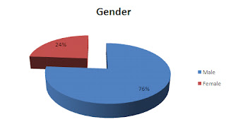
This has allowed me to gather that my average reader is a male boy around the age of 17. His pass times include socialising and listening to music as much as possible. His dress sense is quite modern casual, with band clothing being worn to show his appreciation to the bands. Gigs and festivals are an important to the reader, as the live performances by the band are enjoyed.

Readers of music magazines

Readers of music magazines

In order to gain knowledge of why people are reading magazines I made a survey aimed specifically at readers of music magazines. By finding out why people are interested in reading music magazines, and the most popular features, I am able to identify strengths and weaknesses people find with them, and I am then able to have that knowledge when creating my magazine.

The survey: http://www.surveymonkey.com/s/YW7PYPQ

Results

Q1)


Q2)
Q3)
Q4)
Q5)
Q6)
Q7)
Answers given;
- Interviews
- Gig Reviews/ Upcoming Gigs
- Posters/ Pictures
- Behind the scenes
- Album Reviews
- Charts

Q8)
Answers given;
- None
- Make the cheaper
- Less advertisements
- Stop featuring the same bands weekly/ More diversity in bands
- Colour schemes; too dark
- More pictures

Q9)
Reasons given;
for those who answered no:
- Predictable
- Magazines need modernising
- Change is good
- Will then be unique/ fresh ideas
for those who answered yes:
- Allows for a similar feel to others
- Easy to read and follow
- No need to change something that is already good
- Layouts are suited to the genre

Q10)


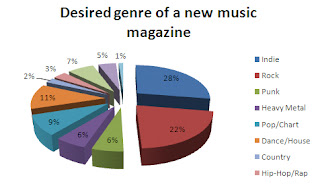
My results show that for my magazine to be successful I should aim it at young people aged 16-20 years old, with the preference of males. The idea genre for my magazine would be an indie magazine, due to this being the popular answer on both what is the prefered genre of music to listen to and what genre for anew magazine should be used. I would keep the design similar to those of existing magazines if I was to agree with the readers, due to it giving a similar feel, with NME and Q being the magazines to base it on.

Non-readers of music magazines.

Non-readers of music magazines

In order to gain knowledge of why people are not reading magazines I made a survey aimed specifically at non-readers of music magazines. By finding out why people are not reading music magazines, I am able to identify problems people find with them, and I am then able to have that knowledge when creating my magazine.

The survey: http://www.surveymonkey.com/s/YQHYZ7H

Results

Q1)


Q2)

Q3)

Other genres of music suggested were; dubstep, ska, Northern Soul, power ballads, folk and acoustic.

Q4)
Q5)
Additional reason given was that they were not marketed enough.

Q6)
Examples given;
- Gossip on bands (similiar to celebrity magazines e.g. Heat)
- More marketing
- Reduced pricing
- Free gifts
- Wider range of bands featured
- Use of underground music
- Nothing could be added; they wouldn't read music magazines

Q7)

Additional genres suggested; ska and dubstep.

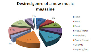
The results of this questionnaire allows me to see that in order to attract new readers to music magazines I would have to aim it people aged 16-20 with the gender preference being girls. The genre preferred by this demorgraphic has been told to be pop music, along with indie and house, however the preffered genre to create a magazine with would be a dance/house magazine, closely followed by a pop magazine. In order to make the magazine more desirable I would need to market the magazine, and allow the magazine to become more like a "celeb" magazine with gossip and gifts.

Surveys

In order to gain an insight to who was reading music magazines and what they were like, I created a survey in which I got a number of people to answer. By doing such a thing I am able to create a general idea of who my target audience etc. should be. I also created another survey in order to find out why people are not reading music magazines, and what could be done to persudade them to buy them. I will be uploading my results of these surveys and the analysis of them shortly.

The Kerrang! Reader.


"Jim, 22, lives and breathes rock music: it informs hischoice of friends, his hobbies, leisure time, attitudes, fashion sense and lifestyle. Above all he is fanatical about THEIR music. He engages with music 24/7, from the minute he wakes up ‘til the minute he falls asleep: when he is not listening to music or watching music TV, he is talking to his friends about music, attending gigs or playing instruments and dreaming about rock stardom. He is plugged in, sharp, has a strong moral code and rejoices in his individuality. He is a fashion trend setter in his peer group but he is heavily influenced by musical icons and scenes. Like the bands he supports he is extremely loyal to the brands he trusts. The way he looks and the clothes he wears is integral to communicating ‘his identity’ to the world."

This is the description given in the Kerrang! Media Pack, which allows me to gain an idea of who reads Kerrang! magazine, which will also help now that I have analysied the magazine understand the choices made within it, and also it will help me when planning my own magazine.

Kerrang! - Double Page Spread

Kerrang!
Double Page Spread


Photography
There is just one image on this double page spread, with this being Angela Gossow, with whom the article is about. The photo is a studio shot, which again creates an intimacy with the reader, as they can feel that they are closer to Gossows life. By having a studio shot, the image can then be staged so that it relates to the text, in which this case it does. Also, the image is staged so that Gossow is looking out towards the reader, which normally forges a friendly connection. However the pose that Gossow in could be interpreted that she is being defensive of herself, and the band, and that they are coming out fighting. Having just one photograph means that the text can be seen as a main focus, as well as this image not being overshaddowed by other images.

Colour Scheme
The colour scheme here is mainly black and white, with a very small amout of red being used. By not using yellow as in the previous two instances, the magazine has broken the consistency of the colour scheme, however the article is quite a serious peice, and this could be interperted that the bright yellow is not appropriate for such a peice. By keeping the majority of the colour scheme the same they are ensuring that the change is not too dramatic, and contrasting with the rest of the peice.

Fonts
The title "Highway to Health" is in a serif font. This marks a contrast with the rest of the article, which uses san serif fonts, which could be in order to make the heading stand out more, and for attention to be directed to this. By using a serif font for this heading it is a visual show of how this heading is different to the rest of the article. With the rest of the text being in san serif fonts, it is keeping in with the design from the rest of the magazine which allows for consistency, and for familiarity. Also by not using a mixture of san serif fonts and serif fonts within the main text it is showing that the rest of the article is a whole.

Writing Style
The writing style here is continuing in the previous style in the fact that it is quite basic. It uses a story-telling feature, where the reader is told what happened on the interview, this links in with the fact that the audience is a younger demographic. However, it uses names of members of bands which shows that the readers of the magazine are serious about music, and will know who they are. The article uses quoations from the interview, instead of the format of question and answer. This could suggest that the reader only wants to know certain information, and therefore only is given.

Text/Picture Ratio
The ratio is around 2:1. As there is only one image, the text is shown to be much larger. However, the image is large and takes up one side of the double page spread, which shows that it is still quite dominant. The large heading also makes the text seem larger than what it actually is. The use of larger headings allows for the false impression that there is more text than there actually is, which allows for the reader to feel they are being given large amounts of information, when they actually are not.

Overall
The double page spread appeals to its intended target audience by using a large picture which allows for the reader to be attracted to the article imidiatley. The basic colour scheme allows for the reader to take the article in well, and also allows for the reader to seperate headings and the main body text due to the different fonts that are used. By using similar fonts as the previous pages, a sense of continuity is created, which allows the reader to feel comftable with the article. The reader is further comftable with the article due to the basic and story like text.


Kerrang! - Contents Page

Kerrang!
Contents Page


Photography
There is several photographs used on the contents page which reminds us that there is a young audience for this magazine, as younger audiences tend to prefer looking at magazines that reading large amounts of text. The stand out photograph is of Marilyn Manson which is a studio shot - creating intamacy with the audience. By looking directly out at the audience he is creating a connection between the two, and therefore engaging the reader. In addition to this shot we can see snapshots of two articles that appear further along in the magazine. This is in order preview what the article looks like, and to capture the attention of the reader. Again snapshots of posters features are displayed near the bottom of the page, these are displayed again to attract the reader and to give a genreal idea of what these posters look like. An image of the editor is shown, this is to gain a connection between the reader and this woman - which then allows the reader to feel close to the magazine, and allows a personal side to be given to the magazine.

Colour Scheme
The colour scheme from the front page is continued onto the contents page. This allows the reader to feel comfortable and familiarize themselve with the magazine. By continuing this, and adding the image of the editor, the magazine is sending out a message to the audience which states that the reader is welcome to feel apart of the magazine, and for it to become more personal than just proffesional.

Fonts
The magazine continues to use just sans serif fonts, which allows for consistency to be created throughout the magazine. By using the sans serif fonts it is helping to give a constant reminder that the magazine is aimed at a younger audience, as the font itself is quite modern and basic, and also by keeping all the fonts the same is it showing that each part has equal value. The use of the smashed "Kerrang!" title again shows consistency and serves as a reminder as to what genre the magazine is of.

Writing Style
The writing style is still very basic, with not much complexity, however the magazine has much more text on the contents page, and goes into detail that was missing on the front page. It gives information on what articles are about, and uses specialist language such as "metallers" and "metalcore". By using language like this, the magazine is aiming at a specific audience, which allows the audience to be attracted to the magazine. 

Text/Picture Ratio 
The ratio in this instance is 2:1. By using more text, it is showing that despite the target audience being very young, images are to be used but text is also important as the magazine is about music, and images can not explain everything. This shows that the magazine is being serious in delievring a magazine based around music, and that it does not need to depend on images alone.

Overall
The magazine uses a continuity of fonts and of the colour scheme, which allows the reader to become familiar with the style of the magazine. The contents page also features more in depth text which shows that the magazine is serious on the reporting of music, however it still targets its audience well by still having the text breif and easy to take in, aswell as still having several images.

Kerrang! - Front Cover

Kerrang!
Front Cover
Photography
The magazine uses many images on their front cover. The main image features Hayley Williams of Paramore, which acts as the background. This image is a studio shot, meaning that the image was created for this purpose, which serves as a reminder that the band is current and together, therefore able to do photoshoots. Williams is looking out at the readers, creating a connection with the readers, and by tilting her head and winking at the camera, she is showing the playful side of her, and of the band. By featuring just Williams, the magazine is reminding the audience that she is the frontwoman of the band. Aswell as this image of Williams, underneath features several pictures of the band in general, this is a reminder that Paramore is band, and that there is more to the band than just Williams. Also on this side it gives a preview of the posters inside, this attracts the readers to the magazine, and allows them to see what is in the magazine before they purchase it.

Colour Scheme
The colour scheme for the magazine is black, white, red and yellow. The red and yellow colours are quite bright, and allow for the magazine to stand out from the competitors, also the two colour contrast with each other - which futher makes the writing stand out. By having fresh, bright colours the magazine is appealing to its young audience.

Fonts
The article uses all sans serif fonts, which shows the magazine as fresh and current - which appeals to the target audience. The fonts are consistent throughout, and exaggerated which allows formiliarity to be made to the audience. By keeping the fonts the same, it could be viewed as stating that the magazine and the different articles have the same importance - an article is seperated from the others by having different fonts. The title "Kerrang!" is shattered - reinforcing the rock image that they are selling. Also the text is in stencils which continues to represent the young audience.

Writing Style
The writing style is very basic and brief. It uses very little text other than simply the names of bands featured inside. This shows that the magazine prefers to advertise all the stories within rather than focus on just one, it could also show that the magazine has many big name artists and therefore they do not need to elaborate on the stories in order to sell the magazine. By using a breif amount of text, it is showing again that the audience is of a young demographic. They give very little information to take in, which makes it easy for the reader to take in.

Text/Picture Ratio
There is more images than text, with the ratio being around 1:2. The magazine, howver, depends on both text and images in order to attract the audience. The images allow a visual image of what is inside the issue, and allow for initial attraction, with the text then futher engaging the attention of the reader by bombarding the reader with the names of the bands/artists inside.

Overall
Overall the magazine front cover appeals to its target audience well. It uses a combination of bright colours and basic text in order to draw the reader in and not overwhelm them with too much information. The simple uses of fonts and stencil style writing allow to confirm the young audience range, with the shattered "Kerrang!" title visually showing what genre the magazine focuses on. The images appeal to the audience, who will prefer looking at images to lots of text.

The NME Reader

The NME Media Pack tells me that:

STATS
Male: 74%
Female: 26%
Median age: 23
Student: 42%

• NME readers are influential's when it comes to mobile phones.
• They are over twice as likely to convince friends and family about what mobiles to buy.
Not surprisingly NME readers arecompletely obsessed by music. Reader research has demonstrated that they rely on the editorial and theads to keep them up to datewith new music. This knowledge thenmakes them the authority in music intheir peer group.
NME readers enjoy watching films, both in the cinema and at home. They tend to buy a new DVD every month(higher than the national average)

Additional information that can be gathered about the NME reader by the images shown are that the reader enjoys festivals and drinking various types of alcohol, they also enjoy playing video games as shown by images of an XBOX and a Playstation. Also the reader likes to take care of there apperance as shown by different brands of clothing and also shop names; also by the hair products shown.

NME - Double Page Spread

NME
Double Page Spread


Photography
The double page spread uses a mixture of studio and live images, which allows for readers to develop intamacy and feel personally close to the band, aswell as being given an insight to what being in their band and their live performances involves. All images are in colour which allows for the reader to acknowledge that the band is current, which is backed up by the studio shots. The pictures are from different perspectives and focus on different things within the band, which allows the reader to see many sides of the band.

Colour Scheme
The colour scheme used is black and white, which allows for familiarity to be gained, and for a basic and easy view at the page. Pink is also used minorly throughout the two pages, which allows for colour to be added, and therefore to break the colour scheme up. Also by using pink, it allows for these peices to stand out, and therefore attract attention. Pink is a typically a colour accociated with females, and by using this colour it could be to represent the fact that the band appeals to both genders.

Fonts
The main heading, the "The Set List" heading and the main body of the text are serif fonts, this contrasts with the title "Front Row" and the body of text under "The Set List". This contrast allows for the reader to differenciate between the two, and understand that these are seperate texts, not to be read together. The curled font used on "The Set List" show that the magazine has a quite young demogrpahic audience, and also allows for this to stand out in comparision with the rest of the text.

Writing Style
The magazine uses a more in depth writing style on the double page spread, with a semantic field of anger being used. This shows that despite the average reader still being fairly young they are knowledgable, and able to understand. There are many quotes from the band themselves, which shows that the article wants to focus on them and their opinions, rather than the journalist voicing their own opinions through the magazine. Despite this, the writing is still very brief as there is not a large amout of text.

Text/Picture Ratio
The ratio in this double page spread is around 1:2, with images dominating the pages. This shows that the audience is young; younger people often prefer looking at images rather than reading large amounts of text. By having so many images, the readers attention is captured easily by this, which also supports the very small amount of text. The double page spread looks full and balanced, despite there being limited text.

Overall
The double page spread is designed well for its intended audience. The use of pictures allows for the reader to be attracted to the article initially, and the limited amout of text also supports the idea of images being more preferable. The basic colour scheme allows the reader to take the article in easily, and the use of different fonts helps the reader distinguish the differences between the texts.

NME - Contents Pages

NME
Contents Page


Photography
The magazine uses several images, all of which are studio shots. This allows for the reader to create a knowledge of who is in the magazine, and for the reader to make a connection. Along side this it also shows that the magazine uses current bands who are able to be photographed. The majority of the images are in colour, which again shows that the pictures are about bands in the presnet, however one image is in black and white. This is also the image that is about the past and signings of bands that happened along time ago, and by being in black and white we are reminded of this.

Colour Scheme
The colour scheme has changed from the front cover, with the colour scheme again using black and white, but with the change from orange to red. This colour scheme is the one traditionally used in music magazines, and it is an indication that the magazine wants to be catogarized with music magazines and is therefore following the theme. The black and white continuity allows for familiarity to be gained for the reader, and also allows for the page to be easy to take in.

Fonts
Sans serif fonts are the ones mainly used on the contents page, with the exception being the heading and an advertisment to subscribe to the magazine. By having a different font, the magazine is making sure readers notice that these are different, and therefore your eyes are drawn to them. This allows for the general idea of the page to be undertstood, and also for the advertisement to be noticed. By then using the same font throughout the rest, the magazine is showing that these are of the same importance and it also again allows for familiarity to be gained.

Writing Style
The writing uses a large amout of pull quotes, which allows the reader to gain a small amount of information on what the articles will include - this allows for the reader to be intrigued and therefore drawing them in. This aside, the writing style is quite breif, with not much detail given, however it is appropriate for the target audience and the fact that it is on a contents page. Aswell as giving a breif amount of information on features inside, a simple and basic list of what else can be found inside the magazine is given, with no extra information - this gives the idea that the writing style is simple to understand.

Text/Picture Ratio
The ratio is around 1.5/2, with there being very little text, the amount of images looks larger in comparasion. There is a picture for every feature advertised, however the images look overpowering compared to the text given with it, due to it being very brief. As the text not related to the features is so breif, with not detail given, it still allows for the images to be dominant.

Overall
By using pictures, the magazine is appealing to its young target audience, which is shown again by not giving a large amount of text. By using pull quotes, the reader is drawn in, and with not a large amount of information being generated on the article, intrest is given by the reader. Using consitant fonts on the contents, bar two, the magazine is giving consistency and familiarty, and the simple and well known colour scheme allows the page to be easy to read and take in.


NME - Front Cover

NME
     Front Cover


Photography
The magazine uses images of several pictures, which are all studio shots. This creates intamacy with the audience, and creates a connection, as all the people featured are looking out towards the reader. The photographs used are all related to the main feature, which allows for this to be the main focus. The photographs have been edited in that they are layered over one another, this again links to the main feature in that they ordered in the "cool list".

Colour Scheme
The colour scheme here is black, white and orange. The black and white is used majorly over many magazines, so this could allow the reader to feel connected to the magazine straightaway, but by using a different colour - orange - it is allowing the front cover to stand out compared to the other magazines. Also by using a bright colour, it is allowing the reader to be attracted to the magazine, such as passing audiences who would not normally look a the magazine, and it also appeals to it target audience, which is quite a young audience.

Fonts
There is a continutiy use of san serif fonts throughout the front cover, which allows familiarity. The use of curled writing on "Who's in? Who's out?" is appropriate for the reader, as this shows the reader is young and interested in "cool" people and not necessarily as intreseted in the music. Using the same fonts throughout the rest of the magazine also shows that this particular feature is the main part of the magazine, and by using the same fonts for the rest shows that they are all equal in importance.

Writing Style
The writing is very breif, with very basic in terms of depth of information. The writing style is also quite demanding, such as the "cool list", it is implying that their opinion is fact and that the people featured are "cool". The magazine uses declaratives alongside this on the front cover, it uses simple statemants of what is to come, along with rhetorical question in order to attract the reader, and make them want to continue in reading.

Text/Picture Ratio
The ratio of text/picture is around 1:2, with the images being the dominant force. This again appeals to the target audience, as younger audiences prefer to look at images, than read large amount of texts. The ratio is also at this place as it is a front cover, and not alot of text is usually placed among a front cover; the images are the usual attraction that reel the reader in.

Overall
Overall the magazine uses breif and basic writing along side pictures in order to appeal to the target audience. The bright colour scheme allows the magazine to stand out and to also be appropriate for the target audience at the same time, with fonts additionally representing the target audience well.

The Mojo Reader

"John is 37, a passionate and discerning music fan, long-time musician himself and dedicated record collector. With his high disposable income, John loves nothing more than sneaking off to the local independent record store to see what’s in. John proudly invests in an extensive mixture of vinyl (classics and rarities), CD’s, and carries a well stocked iPod that covers everything from prog to nu-folk, Motown to 60’s garage, blues and psychedelia. John’s heroes are Bowie and Jimmy Page, he has played the guitar since his school days and gets together now and again for a jam with his muso pals. A heavy gig goer, he also likes the more ‘boutique’ festival experience, having begun to outgrow Glastonbury, he is now just as likely to head to a smaller scale shindig such as Latitude or Green Man Festival. John and his partner occasionally like to unwind at the weekend by packing the toddlers off to their grandparents and inviting their friends around for dinner, whiskey and a rifle through his record collection to unearth some hidden gems. Well read and media-savvy, they chat into the small hours about music, books and films."

This is the Mojo reader according to the Mojo media pack.

MOJO - Double Page Spread

MOJO
Double Page Spread


Photography
The images used are all live images - they symbolise what the double page spread is about - awarding people for their musical talents. The images allow to see the bands and artists playing live - something that the readers may not have been able to do, and therefore it appeals to the reader, as the are given a visual aid of what it would be like to see them live. Also the photographs help support the texts, as it is again a visual aid of who the article is about, and also allows the reader to see images of musicians they are fond of. All the pictures are in colour, this is a reminder that the acts shown are current, and that they are modern, therefore are in colour. The photographs also help us understand the styles of the acts that the audience haven't heard of before, they can see what they look like, what they are wearing and the sets they are on - these can all help them build an idea of what they are like.

Colour Scheme
The colour scheme on the double page spread is black, white and gold. The colour scheme has changed for a third time, however the black and white has remained the same throughout. The black and white consistency has helped build familiarity through the magazine, with an additional colour being added throughout. The gold that is used in the double page spread represents the fact the article is about MOJO Honours shortlist. Gold has connotations of royalty, so by using gold it is represents winners of the awards, and "royalty" of the winners. It agains reinstates the fact that the magazine is quick to change colour scheme to fit with the article - this could show that it is versitile and is willing to adapt, or it could be viewed that the magazine is inconsistent, and too different on each article.

Fonts
The double page spread uses just san serif fonts; it has been a consistent theme throughout. This shows that the magazine wants to keep familiarity throughout; however it could also show that it is plain, and by keeping the writing to one style it could show that the style may become dull and repetitive. By using just san serif fonts, it keeps in with the theme of being an older magazine that talks about current bands, and despite the possible repitiveness, it is easy to take in, and loses the distractiveness of different fonts being used all over the pages.

Writing Style
The text uses a story like form, giving an outline and description of what went on in the day at HMV, however detail is added to this outline of events, such as background information on years songs came out, and details of who Ian Broudie has been producing over the previous few years. This shows, that despite the initial basic style of writing, the magazine takes reporting on music seriously and does research about the artists and does give the readers extra information. The article also links in information about tours, singles and albums about the acts mentioned; the magazine knows how to create publicity and information that the readers want to know. By doing such a thing, the readers see that they are a reliable source for information, which then will persuade them to read more.

Text/Picture Ratio
The article has an even amount of text/picture ratio, implying that the images are just as important as the text. This also shows that the article does not need to depend on pictures to sell the article, and that the magazine can do a more in depth peice.

Overall
Overall the double page spread uses the same fonts that it has throughout the magazine which gives a consistency, which makes up for the fact that the colour scheme has changed yet again, however the gold in this allows to enrich the idea of awards and winning. The storylike theme throughout this is embedded with indepth details, which prove the seriousness of the music magazine and the dedication that the readers want. The images throughout allow the readers to create a visual image of the acts - which again ties in with the story like theme.

MOJO - Contents Page

MOJO
Contents Page


Photography
There is one image on the contents page; which is of Trent Reznor, who features in part of the magazine. The image is a studio shot, which usually allows the audience to feel a connection and closeness with the artist, however in this image Reznor is not looking at the camera - but looking away to the side. On the front cover it is hinted that he had a troubled past; so looking to the side of the camera, and what looks like into the distance, it could be a visual representation of Reznor looking towards his future, which looks bright once more. By wrapping his arms around him he is however sheilding himself, and it could look to the audience that he is not quite ready to let the public fully into his life. The image is in colour, where the main image on the front cover was black and white, this could show that he is a different artist to the main picture, and it could also represent how his future is looking bright once more, and is no longer dark.

Colour Scheme
The black and white colour scheme continues onto this page, however the green is replaced by red - which is the traditional colour used by music magazines. By changing this colour scheme, it shows the audience that they are spontaneous, and can mix up the style of the magazine easily. It also implies that the front colour scheme could have been just because of the feature guests, and that they are open to changing the style of the magazine to suit the guests who appear on it. Despite changing the colour scheme quite suddenly, the continous use of black and white allows for some stability in the magazine, and allows the readers to have some familiarity throughout. The main text colour is white - with the only use of black being the background; this allows for a contrast in colours and allows the reader to be attracted by the bright colour of the text.

Fonts
The contents page uses just sans serif fonts, much like the front page. This adds to familiarity throughout the magazine, and allows the reader to feel like they can relate to the magazine. By using one consistent font they are showing that they are one style magazine - they do not swtich between styles in genre (even if they change the colour schemes). This also underlines the fact that the audience for the magazine is for an older audience; by keeping it in one font they are not changing the image and showing they are a stable magazine that is consistent meaning the audience will like the repetiveness of the style throughout.

Writing Style
The writing style for the contents page is still quite minimal, but it goes into much more detail that the front cover. It recognises that despite being teenagers, the audience does need some depth and detail in its writing in order to appeal to them. Pull quotes are used again, although they are seperate pull quotes, this allows to build a bit more of an idea of what will be in the article, and this is added to by the breif statements underneath the main page titles. Colloquailisms such as "psychedelic" are used, which appeal to the older audience, as words like these will have been used within their childhood. Also by using phrases such as "conquer the world" they are allowing to build up large reputations for the guests featured - making it seem more appealing for having such good bands/artists in the magazines.

Text/Picture Ratio
The text/picture ratio is about 2:1. There is more text than pictures on the contents page, with the detail that lacked in the text on the front page being added on the contents page. There is only one image on the contents page, which shows that they have diversity - they do not have to rely on all pictures in the magazine, and that the actual text is just as important. Also by only having one image, it could imply that they do not need to rely on images to promote the artists features - that they can attract readers by having such impressive names. It could also show that they need to promote the story of Reznor as he is the only person to have an image on there.

Overall
Overall the contents page contrasts slightly with the front cover; it uses more detail in its writing, however it is still breif and is quite specialist to its audience due to the colloqualisms used within. It uses only one image and it uses pull quotes; both are used to sell one feature, which suggests this is the story that they are trying to promote the most. It has a consistent font style which allows for familiarity, however consistency in colour scheme is ruined by the swapping of the uses of green for red.

MOJO - Front Cover

MOJO
Front Cover


Photography
MOJO magazine has used an image of Kings of Leon as its background for the front cover. The picture is a studio shot, with the picture being posed for this one principal. All four members of the band were looking directly at the camera when this image was taken - therefore giving the impression that they are looking straight at the reader. This will allow the reader to feel a connection with the band and image before they have even opened the magazine. The image is in black and white, which allows contrast with the colour of text, which is a contrast to the other two images which are in colour. The other two images are of artists who are no longer in the charts, therefore the use of black and white on the main image could be to show that they are different from the other two. Also it could be a reference to the fact that they are no longer in the usual working day life due to "being on the road" and being in black and white would be a reference to this. The image of Trent Reznor seems to be a profile shot, which is a studio image. The use of a studio image could be in order to show that the artist has got through his problems and is now able and willing to do interviews and photoshoots, which is reassuring to the readers. The image of the Sex Pistols front man, again a profile shot of Johnny Rotten is a live image, this could be to show that despite being highly regarded, the band only realeased a few singles and are no longer together.

Colour Scheme
The colour scheme for MOJO magazine is black, white and green. Black and white is often used in music magazines, however magazines normally use the colour red. The use of green could be move to seperate itself from the other magazines, to show that it does not conforme to the rules other magazines use, and to distinguish itself and stand out to its audience. The green on the magazine contrasts heavily with the other colours, making the texts on the magazine stand out - and therefore attracting readers attention; this could be another reason why the magazine it using the colour green. Along with this, the colour green has connotations of prosperity, growth and life. These factors could be a representaion of the colour green on the magazine; the growth and lifes of the bands uses on the magazine, and how bands prosperity (and the magazines) expands.

Fonts
The whole front cover uses sans serif fonts, which could be to show how it is a modern and popular magazine. Serif fonts can be used to show formality and classical themes; the opposite to what the magazine is. By using all sans serif fonts the magazine is showing to the audience that they are a current magazine, and also that they are consistent in the fact that they do not need to use several different fonts on the cover. It also allows the reader to get used to the format of the magazine; by keeping the fonts the same, the reader is give the idea that this theme will run throughout the magazine.

Writing Style
The writing style is basic and breif. Not much detail is given on the front cover, the main focus is on promoting the artists/bands featured on the magazine, for instence they list the artists inside "PLUS! DOVES, KASABIAN...." but do not give any details of why they are inside, or where abouts in the magazine they feature. They also use pull quotes to draw readers into the Sex Pistols and the Trent Renzor features - whilst giving the reader an idea of what the article may be about, it does not give a clear indication and could become confusing. The audience are deemed to be more intrested in pictures (shown by "Neil Young. His Archive... In Full!) and stories that they feel may be "glamourous" and live up to the "rock star" cliche e.g. "ON THE ROAD WITH THE WORLD'S BIGGEST ROCK BAND!".

Text/Picture Ratio
I think that the text/picture ratio is fairly even, with the images being as just as much as the text. The magazine has many features in, and has to promote and generate intrest in most of them, therefore the text on cover is promoting these stories (and depending on their names alone to be able to sell the stories to the public). However, images capture the attention of the reader, and therefore using the large image of a current rock group initally attracts the audience to the magazine, with the text around it then being able to help promote it. By adding images the magazine is ensuring visual recognisition of names such as The Sex Pistols and Trent Reznor.

Overall
Overall the MOJO front cover appeals well to the intended audience; it uses basic and brief text on the front cover, whilst using a dominating image of a popular band to attract the reader to the magazine. Combining these factors with a unique colour scheme, which allows the magazine to seperate itself from the other magazines and from blending in with the others again allows for a unique and striking image. By using simple fonts, it is consistent throughout, and allows for the reader to take in the information easily.

The Classic Rock Reader

Engaged & Loyal
• Spend on average
4 hours reading each issue
• 96% have taken a positive action as a result of seeing ads/articles in the magazineClassic Rock readers talk about music and are knowledgeable.word of mouth holidays, cars, entertainments and technology all feature on their shopping lists.
• These men like quality and are prepared to pay for premium products and services-
• They will influence others through

The Classic Rock media pack tells me that their readers are:

• Aged 35+, many of whom are entering a lifestage
when they are regaining their wallets, freedom and
teen spirit.

Classic Rock - Double Page Spread.

Classic Rock
Double Page Spread


Photography
The photo is a live photograph, much like the previous pictures, however this time is focuses on the band as a whole, and not just Pete Townshend although he is the dominance in the picture. The image used is a visual summary of what The Who where about, and what being at one of their smaller gigs was like. This will appeal to the audience as the image is empasises everything the band stood for, and it also represents their image and style. By being in black and white is also adds to the authenticy of the image, it shows that it is an aged image, which adds to the reminder that the band is aged. Again by not using a studio image, it is a constant reminder that the band are not a current band, which has been running throughout the images in the band. As the picture is dominant over the double page spread it adds to the fact that despite being quite a bit of writing, the images of the band are much more popular, and that this is what the audience wants to see much more that two pages full of writing.

Colour Scheme
The colour scheme of red, white and black has run along the magazine into this double page spread, which adds to the familiarity of the magazine, and also makes the readers feel at comfort. With the main image being in black and white, the double page spread looks quite dull, however by adding in bits of red here and there, the spread looks slightly brighter, and attracts the reader much more. The double page spread uses the colours simply, making it easy to look at, as the colours are not too busy and allows the reader to take it in easier. By not overloading the page with colours, it gives the page a simple look, which allows for compatibility with the busy main picture within it.

Fonts
The whole of the peice is in a sans serif font, except for the large T at the start of the text. By using all sans serif font, it is allowing the article to stay in the same bracket, for example it does not have bits that seem more important or look different by using lots of contrasting fonts. This way the reader does not have to adjust to the several fonts and can continuosly read the article. It could also be a reference to The Who themselves - how they had a certain style and stuck to it, not having to keep changing styles over the years. The one part of serif font(which is also in red) starts off an anecdote from the reporter. This is to show that this is not part of the article, and this is just a personal note from the writer himself, and that the actual arcticle starts afterwards.

Writing Style
The article is a stark contrast with the rest of the magazine, there is much more of it, and it is in much more detail. The language used is much more "violent" that the rest of the magazine, with this being the semantic field, with words such as "electric fury", "ear-bleeding" and "dragged". These words are used in order to create a vivid impression of what the era was like and how the concerts played by the band were crazy. The reported uses specialist language with phrases such as "five-bob" which will be understood by the intended audience, however a younger audience would not be able to relate to this at all. It also goes into details of clubs that the band played at, which are now well recognised, which will probably hold memories for the readers, however younger audiences will not recognise such places, with big arena's and o2 acadameys now taking their places as the latest music venues. It also talks in details of the mods, and the style and ideas they had - obviously the majority of the bands fans will have been mods, so to mention them would be a technique in which to bring back their own memories and for a way for the reader to relate themselves to the article and fit themselves into it. The article then goes into detail of the "Maximum R&B" promotion and ideas other PR's had for them - this will allow the reader to feel close to the band, and allow them to gain insight they previously might not have had. It also gives reasons to why the band did certain things, such as "The ideas behind Townshends union jacket", which again allows readers to understand the band more.

Text/Picture Ratio
The image is much larger than the text, and the text/picture ratio is around 1:2. The image dominates the text, but helps support it, as the text next to it has parts that refers to things that can be spotted in the images. This allows the reader to have a mental and visual image of what the article is describing. As there is quite alot of text, the image allows for a breakup in this, and allows the double page spread to be taken in easily by the readers. The text doesn't overload the reader, and again allows the reader to view images of iconic bands.

Overall  
Overall, the peice allows readers to be given information that they may not have previously known in large details, without it being set out in a strict "textbook" style. The image allows for the text to be given without overwhelming the reader. The simple colour scheme gives a welcoming feel to the audience, and is not too busy for the reader to take in. The consistency of the fonts throughout allows a smooth flow in reading, and keeping the same level of importance through the peice, whilst the specialist language and semantic feild make the article appealing specifically for the intended audience.

Classic Rock - Contents Page

Classic Rock
Contents Page

    Photography
"Features" page
The main photo on the "Features" contents page is again a live image of Pete Townshend, this highlights the fact that The Who were a live rock band - and the only way you could see them prefrom was to see them in concert, unlike in todays society where we can easily see live performances on youtube and on music channels. Again by not using a studio image, "Classic Rock" is underlining the fact that the band is no longer together, and that a studio image is not appropriate. Also by using a live image, we are able to capture the image of the band and re-live their style and concerts - which appeals to readers who are no longer able to see this band with its original line up. The bottom of the page is littered with old concert tickets and newspaper articles. It also features a picture of Pete Townshend which is foregrounded out of this smaller images. The newspaper clippings and tickets are a visual reminder of how popular the band was and of their achievements they gained over the years. It allows the reader to quickly regain memories of the band in their heyday before they go to read the feature article about the band. The foregrounded image of Pete Townshend serves as a contrast to what the band was like during their live performances (the main image) and what they were like in general - allowing the reader to feel more intimate with the band, like they knew them personally, even though this isn't a studio image.
"Regulars" page
Much like the cover page, the "Regulars" contents page uses just one image. This image is of Bruce Springsteen in an iconic pose. The magazine promotes the fact that their magazine is for "classic" bands and artists by using an image in which you can not see Springsteen's face - which is the way we would normally recognise the artist being captured. By using this image, it is showing that the readers can recognise artists simply by seeing images - they do not need the obvious ways to acknowledge who the image is of. As there is only one image it adds to the legacy of this image - the image is a stand alone image and is does not need to be supported by others surrounding it. This image is iconic of Springsteen and we do not need additional photography to tell us of who he is, or how successful he is. The image and how strong it is, is further added to by the fact that it is black and white. By being black and white it is stripping away all addition persona that can be added to a person by the colours they wear (e.g. Lady Gaga is recognisable for the bright colours and outfits she wears) and leaving the bare essentials. By using such a strong image that readers can relate to, they are made to feel connected to the peice as they understand the image whereas people from a different audience may not.

Colour Scheme
"Features" page
The colour schemes used on this contents page are similar to the ones on the cover page, except that the gold is replaced by black, which could be seen as a lack of importance to this page to add gold colours, which is quite a rich and important colour. The red tint that is on the main image ties in with the caption "red-hot", showing a denotation of him being red hot. Again as discussed with the front page red has connotations of passion; this could be to show the passion of Pete Townshend on playing live. Also because there is little use of red on the rest of the page, the fact that this image is red dominates its surrounding which allows attention to be drawn to itself. The colours used give a sense of familiarty, and allow the reader to feel comftable with the setting of the magazine as it is keeping at a consistent rate. The use of black contrasts with the white background, giving the text significance and allowing it to stand out to the reader. The use of red and white against darker backgrounds again allows for contrast and for the reader to draw their attention to this
"Regulars" page
The use of red, white and black in continued on to this page, again adding to consistency and familiarity for the reader, however there is an addition to the colour grey. The colour grey is added to the main titles such as "photo pass". It is significant that these titles are in the colour grey and that they are on the regulars page. By being in the magazine every single week, it is adding even more the theme of older things in the magazine, and by using a light and faded grey colour it could be viewed that the colour has faded over time due to the fact it is there every week. By not using a colour that runs throughout the colour schemes, it is seperated from the rest of the text - it shows that this part of the magazine is consistent and relied upon, it is ritual, however the people featured in these parts of the magazine change weekly, and hence by using a seperate colour it shows the reader that this is always the same. By using the colour red for the names of artists and bands featured in the magazine, the readers are drawn to it, therefore giving an idea of what is to come, and to persudae the reader to continue reading.

Fonts
"Features" page
There is a mixture of fonts on this page, with serif fonts being used for the headings e.g "46 Pantera". These are used to show that these are this is the main part of the contents page and that these are the parts that give the information of what is to come throughout the magazine. Also these headings are the parts that will be read first, so by continuing the "classical" mass head theme from the front cover, the magazine eases the reader into familiarity and comftability. It also adds to the feel of superiority - the headings are the formal part of the contents page, so by using serif fonts, they seperate themselves from the rest of the text on the page. Sans serif fonts are used throughout the rest of the text, such as the statements underneath the headings. This text is much smaller, which could be seen as a sign that they are not as important as the headings as the headings are the ones who grab the readers attention. The text which is placed on top of the image is also sans serif (and larger) which contrasts with the formality of the headings.
"Regulars" page
The regulars page uses the same style of fonts, this allows for a similar feel throughout, which adds to the consistency of the magazine and adds to reader familiarity and allows theme to feel comftable with the style which is likely to run throughout the magazine.

Writing Style
"Features" page
The page, again, does not have lots of writing on it, and is again overpowered by images. However the writing that is on there is breif and straight to the point. It lets the reader know what is in the magazine and doen't add unneccessary information that the reader does not want/need to know. The register is again medium, it is not too complex or formal, as this wouldn't appeal to its intentional audience. It does use some rhetorical questions, "Crisis? What crisis?" which allows the reader to think, and gather their own views before reading the article. Despite being brief, it manages to give quite a detailed insight to what the articles are about, this techinque allows for intrest to be generated by the readers. With that taken into account, the magazine doesn't overpower its readers will lots of information, it allows the classic names to create intrest in the articles and therefore allows the readers to feel at ease with the magazine and overwhelmed by a page full of information. Aswell as this, it gives the readers a chance to again pay intrest to the images, as they are not obstructed by lots of text, something that will appeal to the readers.
"Regulars" page
Along with having similar fonts, the two contents pages have similar writing styles. This gives the reader a chance to get used the style that will be used through the rest of the magazine. However this page has used a pull quote in one of the statement boxes underneath the headings. This is a technique that allows the reader to preview what the article will feature, and it again allows excitement to build in the reader, and ensure that they will read the rest of the quote. It does not overwhelm the reader with information, but strikes a balance of what is the right amount of information to give. The magazine uses simple declaratives; simply statements of what is going to be in the articles, this way the article is not pushed upon you, and the reader feels more at ease with the features.

Text/Picture Ratio
"Features" page
The pictures again are the dominant feature on the page, which again has a ratio of about 1:2. The reader is not overloaded with information on the page, as the images often create a great generation of intrest, and this is often a selling point. Aswell as this, readers are more often intreseted in looking at images are they allow you to relate with the band more and relive memories more than words; this is particularly true in this case, as this article is about an old band that is no longer together; articles about them are rare and therefore the images are more important to the readers. The contents could have had more text included, however I do not feel it would have looked as good, as this balance seems to work well.
"Regulars" page
In this case, the text is larger than the image, with it being around a 2:1 ratio. This may be because the "Features" contents page is focusing on the main article and therefore adding many images in order to promote the band and the article itself, whereas the "Regulars" contents page has the same setting each week, so therefore readers know whats going to be on here, and therefore it doesn't need to be decorated with images as much. As well as this, the image that is used is so iconic and so recognised, there was no need to add extra images. The amount of text is at a similar amount, it just seems to the reader that there is more writing because there isn't as many images to look at as there was on the previous page. Like the previous balance worked, I also feel this one is balanced well, and even though there is only one image, it does not look bare.

Overall
"Features" page
The "Features" contents page emphasises on the classic imagery of the band, it focuses on achievements previously gained and showing the popularity of the band, with little reading. It is captivating the idea of live images and the popularity of them with their fans and using this in excess over the page. The writing is brief, but gives a good detail of what is to come in the magazine, which appeals to the reader, and to what they look for in a music magazine and it also allows the reader more viewing time of the images, whilst the colour scheme allows the readers to feel a continous pattern emerging and to familiarise themselves with fonts and styles of the magazine.
"Regulars" page
The "Regulars" contents page has much more focus on text, with the one and only image being an image of Bruce Springsteen, however it is an iconic image and stands strong against the white background. The page uses minimal amount of colour, with the colour red only being used for the name of bands/artists featured and page numbers. By mainly using the white and black colours it is a reminder that everything that happens on that page is there weekly and could be seemed as saying that the page is consistent and the same weekly. The writing is kept breif again, but still has detail in there, with the text being the main focus on this page.