"In what ways does your media product use, develop or challenge forms and conventions of real media products?"
My media product, a music magazine, uses and develops forms and conventions of real music magazines in several ways. During my research I analysed in detail exsisting music magazines, and used the knowledge gained when creating my own music magazine, however I put my own interpretation upon them, and decided against following some of the aspects of a music magazine. I feel that I have not challenged many of the forms of a real music magazine, as I feel they work, so I have therefore just used and developed most of them.

 Front Cover

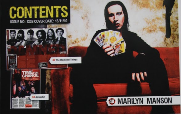
For my front cover, in order to attract the reader and gain intrest in it, I added a list of names that will be in my music magazine, much like the front cover of Kerrang!:
To give coherence with other music magazine, and to make sure that there is some familiarity for the readers, I have kept the concept of having my masthead at the top of the page, along with having features such as having a price, issue number and a barcode.


Develop:
Like the other front covers I used san-serif font for my mast head, however my differed slightly in the fact that it was not block worded:
In addition to this, I also developed the red/white/black colour scheme that has been used by the other music magazine, I have done this in order to differentiate my magazine from the others out there.
Challenge:
The one thing I have challenged on my front cover is the use of images. I have used a solo image (Classic Rock used just one image aswell, however the majority uses several), for the whole of the front cover, and have also edited this image so that it can look like motion in the background. This may seem a risky option, as images normally attract attention, but much like Classic Rock, my magazine is aimed at people dedicated to music and do not rely on images.
Contents Page:


I use a similiar column style positioning to list the features on my contents page, I also use a similar way of using the numbers to label the pages:


I also use the positioning of "Contents" being at the top, along with using a descriptive paragraph to explain what each feature will be about. I use also the idea of having a larger font for the title of the feature, and also using san serif fonts for the titles in order to give them some importance and meaning.
Develop:
I again develop the use of having the red/white/black colour scheme, and also develop my contents page by adding a editiors column, in a similar was to the Kerrang! contents page, however I do not add an image of the editior, as I feel that communication between the magazine and the reader is important, however the magazine is a music magazine, and information and images of the editor are not as important.
Challenge:
I have again challeneged the forms and conventions through my use of imagery. As shown in the real music magazine contents pages, several pictures are used, and are also shown to be labeled to the correct page to turn to. However, I have used just one image again, and not numbered this. I have done this purposely to show how my magazine is aimed at a serious music audience; they would know who this person is, and they do no need the extensive use of imagery. In addition, it is not numbered as they will know who the person is so they can easily cross reference to the listing and find just as easily the page to turn to.


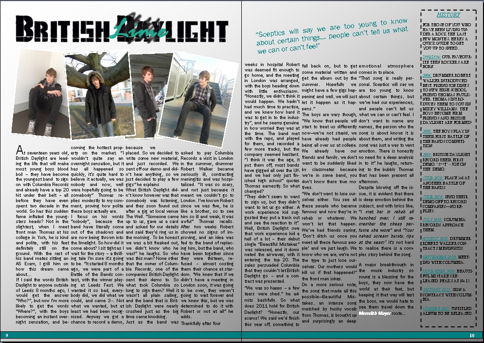
Double Page Spread:


Use:
In the same way to the other magazines, I use columns in order to store my text, giving it a structure and an easy to view form. In addition to this I also use an introductionary paragraph in order to give the reader a little bit of information on what is coming up in the spread.
Develop:
I have used a pull quote in my article in order to attract the reader full on, this gives the reader more information about what the article is about than given in the introductionary paragraph, I have done this in a slightly different way than what NME have done theres; with the quote being a different colour in order to make it stand out further. In addition I have given a "History" column, showing the background of the band. I have done this as my audience are fanatic about music, they like to know details such as when the band formed etc. and this bar allows for this need to be addressed:
Challenge:
Unlike the other magazines, my double page spread does not have a main image, it has four small, individual images. I have done this as it allows me to show different personalities of the model, and also because my reader does not require large images to dominate the page. By doing this, I am targeting my audience and allowing more room for the article; which suits my reader who would prefer information than images.

No comments:
Post a Comment